Logo/Branding
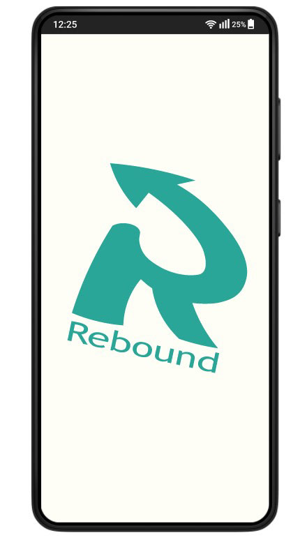
For the brand standards, I decided the brand itself should have a neutral feeling using a monotone/relaxed Teal style color palette and typeface to give a mature and comforting appearance that users could remember.
Mobile Support App
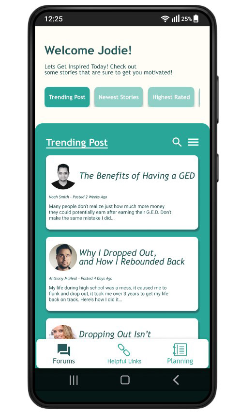
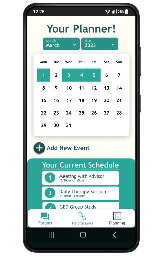
The Rebound Support App is the highlight of the Brand, the main features of the app include a digital forum where people can share resources and stories on continuing their education. A digital planning feature meant to help users bring a set structure and help them plan out their day and manage time responsibly.
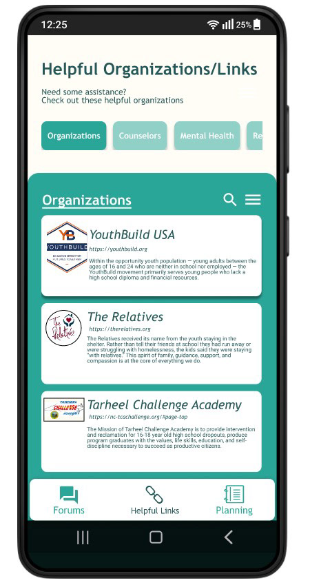
Finally, a resources page with links to organizations, professionals, and more groups that specialize in assisting people in finding careers and education opportunities.
Finally, a resources page with links to organizations, professionals, and more groups that specialize in assisting people in finding careers and education opportunities.
Promotional Poster
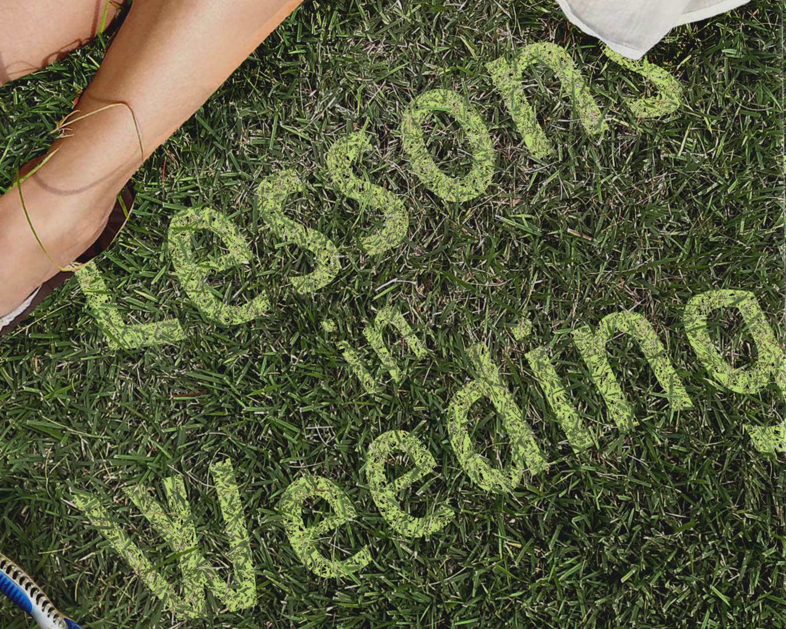
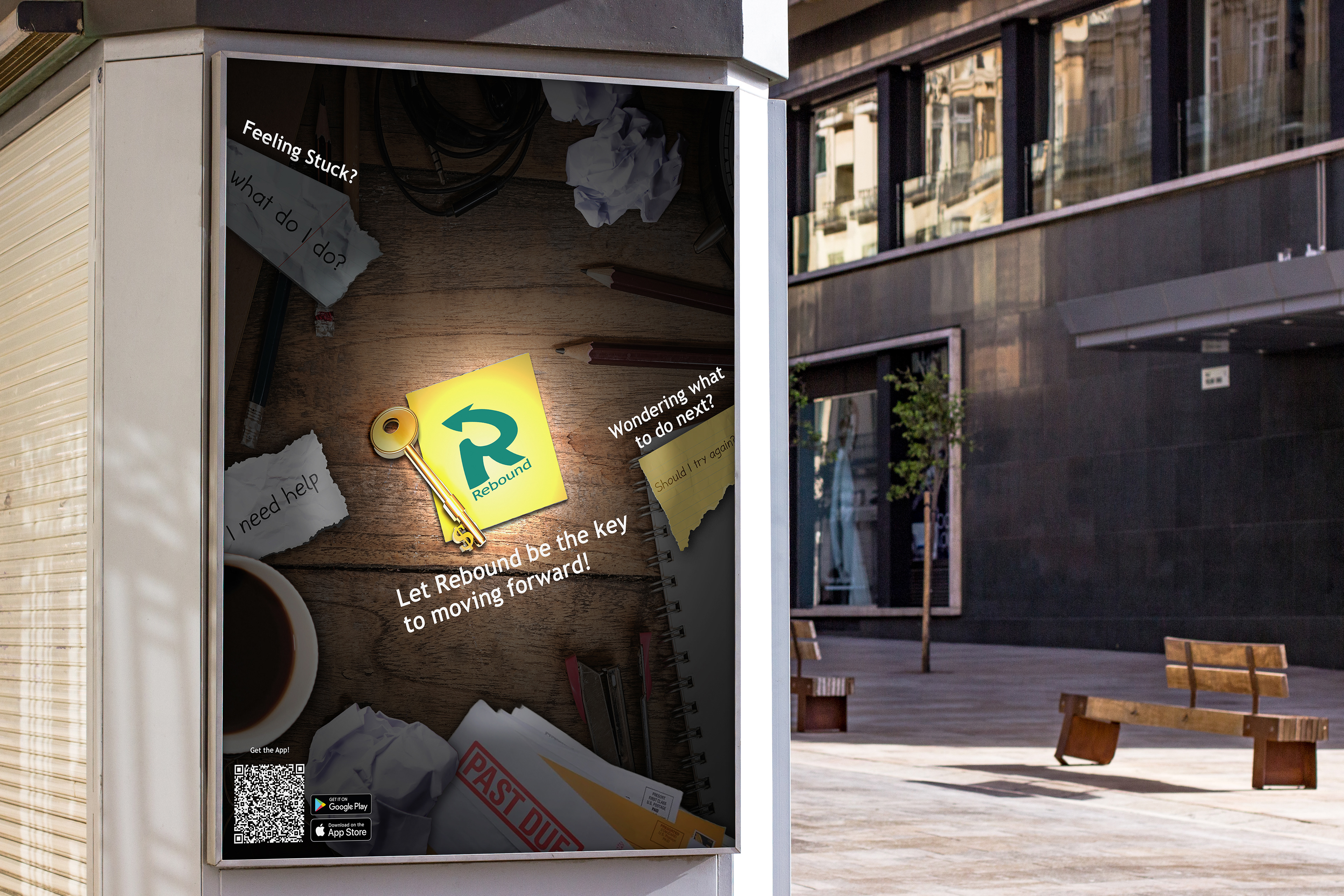
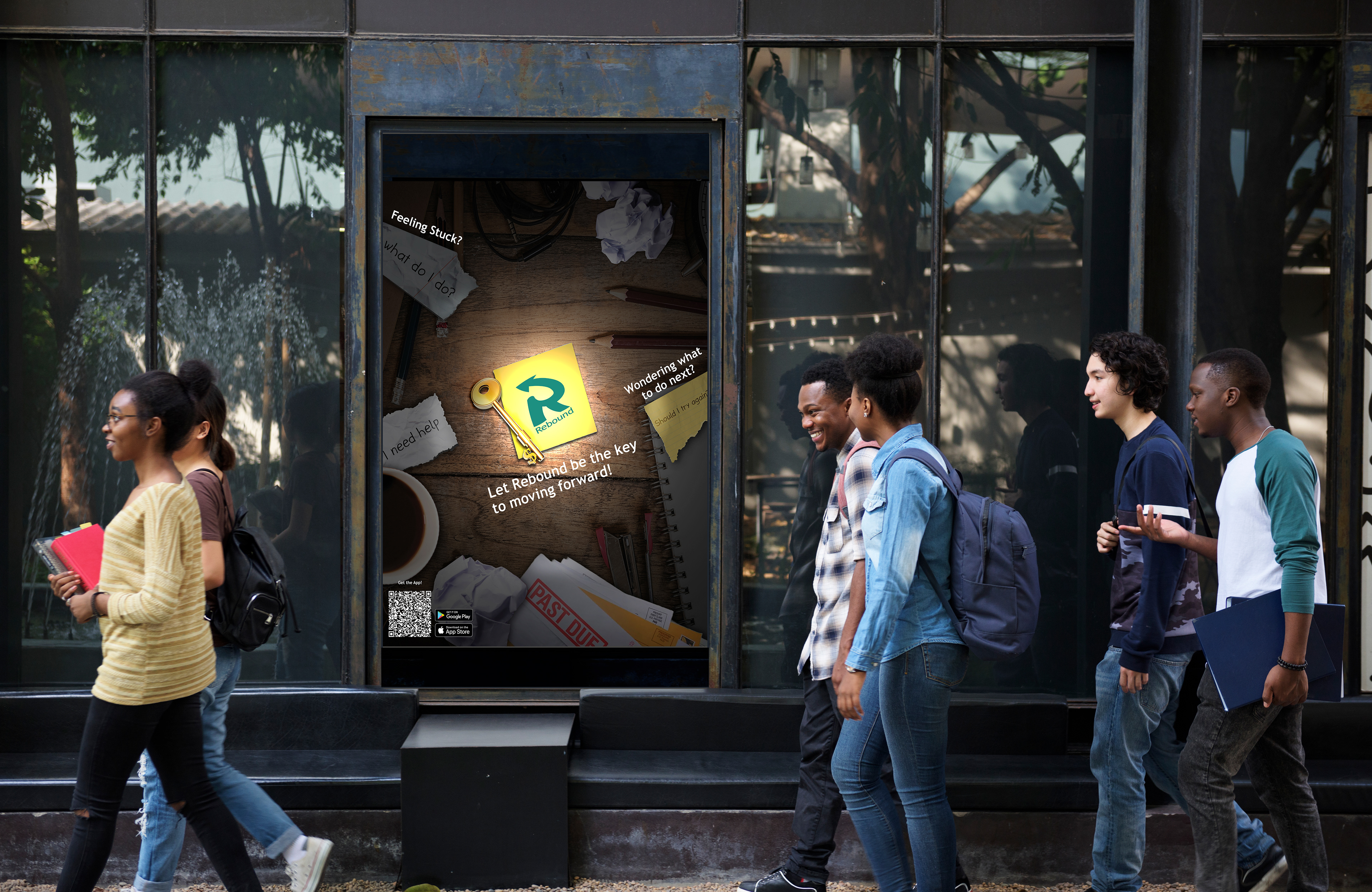
The promotional posters were designed with the objective is to motivate viewers to continue their education and also promote the brand itself through the use of composited photos. The scene presented within the composite is meant to be relatable and connect with the viewer emotionally, the posters will be placed around Charlotte in high-traffic areas such as transit stations, urban areas, and billboards to best promote the app to a large number of people.
Rebound Support Package and Contents
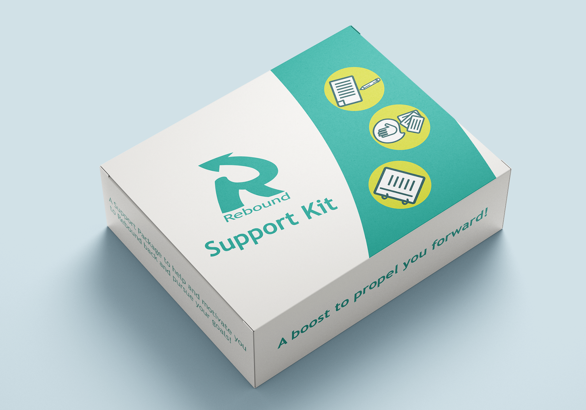
The support package consist of a collection of materials and items that could assist someone when they do work and study. Utilizing branding standards, the package is designed
in a simplistic style with illustrations
on the cover showcasing the contents present within the box itself.
in a simplistic style with illustrations
on the cover showcasing the contents present within the box itself.
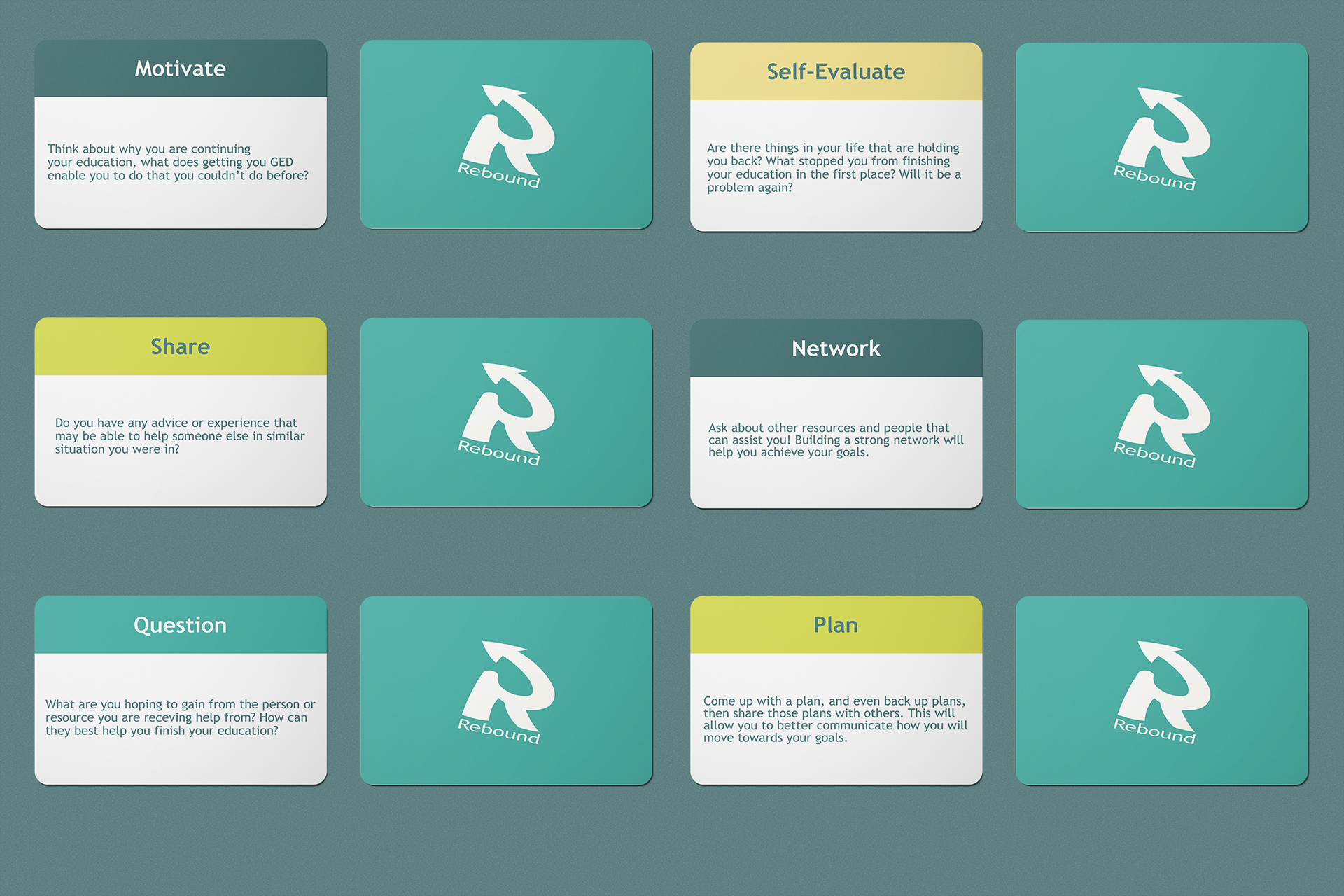
The items included within are: Greeting Cards meant to help users facilitate communication and open up about continuing their education,
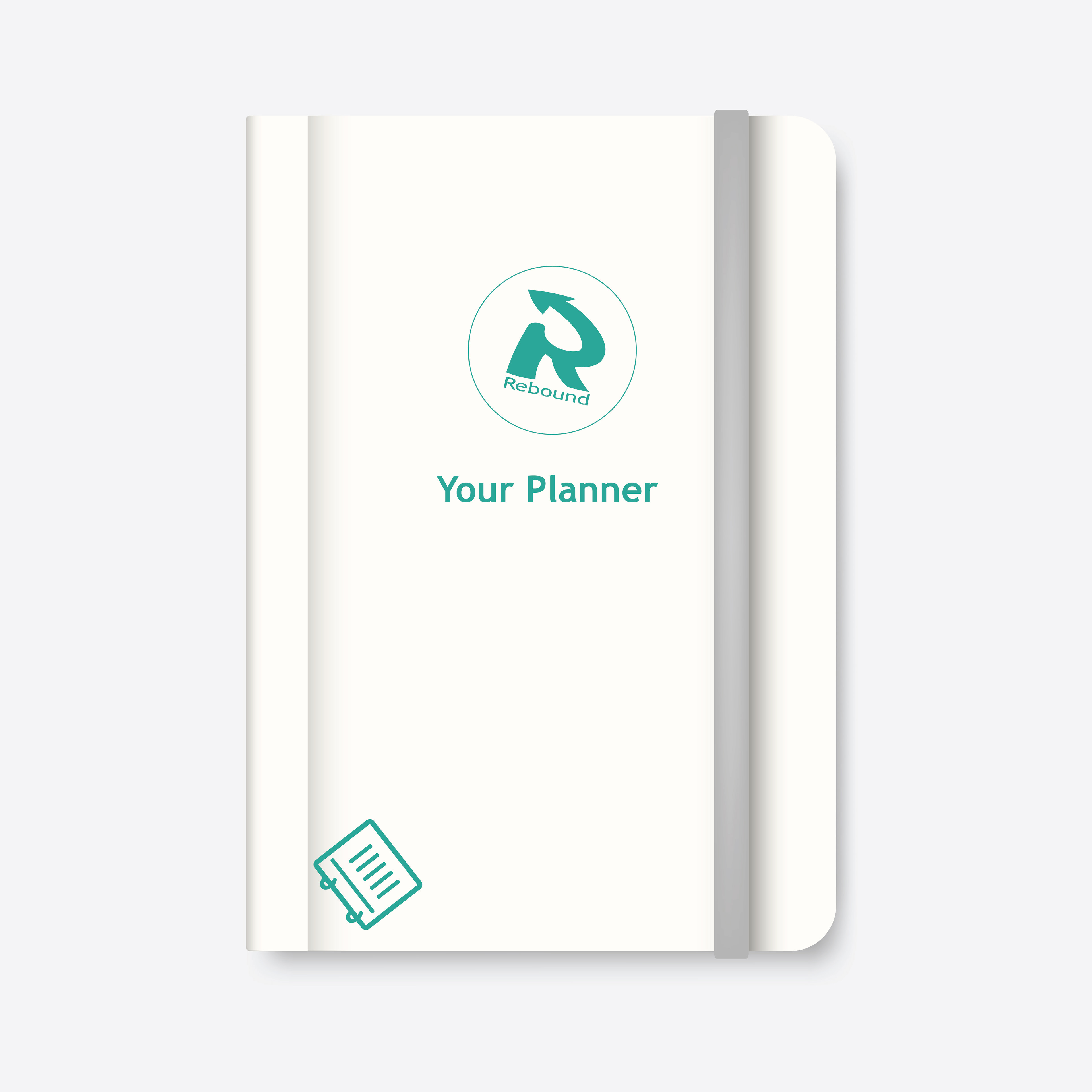
a planner/notebook, various school materials, and finally some fun stickers that the user can place on their materials and items.
a planner/notebook, various school materials, and finally some fun stickers that the user can place on their materials and items.
Senior Exhibition Presentation Video
